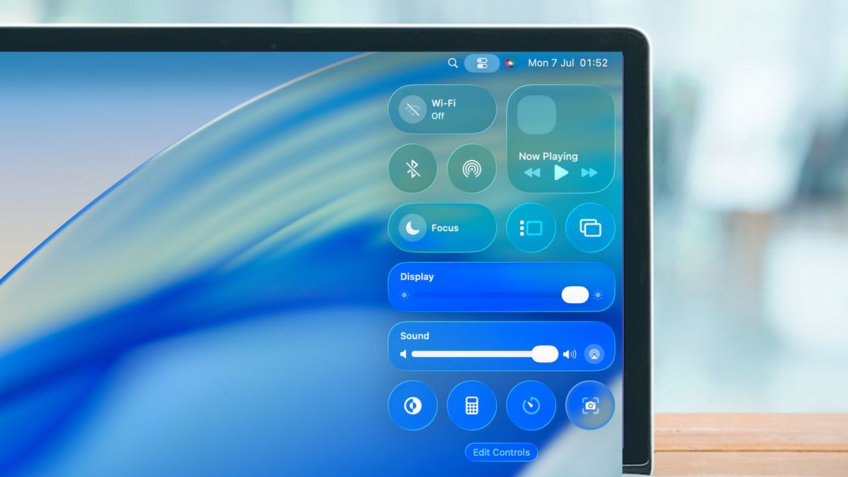
macOS Tahoe’s Rounded Corners: When Design Aesthetics Break User Instincts- Apple’s macOS Tahoe has been a lightning rod for design criticism since its release. First came the backlash over Liquid Glass. Then users revolted over the icons. Then they revolted over different icons. Now, there’s a more fundamental usability issue emerging from the redesign—and this one affects something users do dozens of times a day: resizing windows.
The Problem With Pretty Curves
In Tahoe, Apple increased the corner radius on windows, making them more generously rounded than in previous versions. It’s an aesthetic choice that aligns with Apple’s broader design language across its ecosystem. But as software developer Norbert Heger discovered, those prettier corners come with a hidden cost to usability.
The issue is deceptively simple: rounded corners fundamentally change where users can click to resize a window. When you increase the curve radius, you reduce the clickable area at the actual corner—the exact spot where decades of muscle memory tell users to aim their pointer.
Where Intuition Breaks Down
Here’s what’s happening under the hood. The resize activation area now exists primarily outside the visible window border. When you move your pointer toward the corner from inside the window—the natural, instinctive approach—the resize cursor doesn’t activate until you’re extremely close to the edge. This creates the impression that you need surgical precision to grab the corner.
The alternative is equally unintuitive: you can click outside the window entirely, in the space beyond the rounded corner. But moving your pointer outside a window to manipulate that window contradicts every learned behavior from years of graphical user interfaces.
The Mismatch Between Visual and Functional
This is a textbook example of form undermining function. The visual design suggests one interaction model—grab this corner that you can see—while the functional reality requires a different one—actually, aim slightly outside where you think the corner is, or get very, very precise with your clicking.
For users who resize windows frequently—developers, designers, writers working with multiple documents, anyone doing serious multitasking—this friction adds up. It’s death by a thousand tiny frustrations, where each resize operation requires just slightly more cognitive load than it should.
Why This Matters
Apple has always prided itself on interfaces that feel natural, where the system responds to user intent rather than requiring users to learn arbitrary rules. The magic of good interface design is that it becomes invisible—you stop thinking about the tool and focus on the task.
Tahoe’s rounded corners break that contract. They force conscious thought into an operation that should be pure muscle memory. You find yourself thinking about how to resize rather than simply resizing.
The Broader Pattern
This isn’t happening in isolation. The accumulated design changes in Tahoe—Liquid Glass, the icon controversies, and now the corner radius issue—suggest a design philosophy that prioritizes visual aesthetics over interaction ergonomics. Each individual change might seem minor, but collectively they’re eroding the effortless usability that has been macOS’s hallmark.
The corner radius problem is particularly frustrating because it’s so fundamental. Icons you can ignore. Visual effects you can disable. But resizing windows? That’s core interaction design, and when it requires users to fight against their instincts, something has gone wrong.
What Needs to Happen
The fix is straightforward in concept: either reduce the corner radius to restore more intuitive clickable area at the actual corners, or expand the resize activation zone to better align with user expectations. The technical challenge isn’t the issue—it’s whether Apple will acknowledge that aesthetic preferences shouldn’t override usability fundamentals.
For now, Mac users are left adapting their muscle memory to accommodate design decisions that make their daily workflows just a bit more friction-filled. And that’s exactly the opposite of what great interface design should do.


